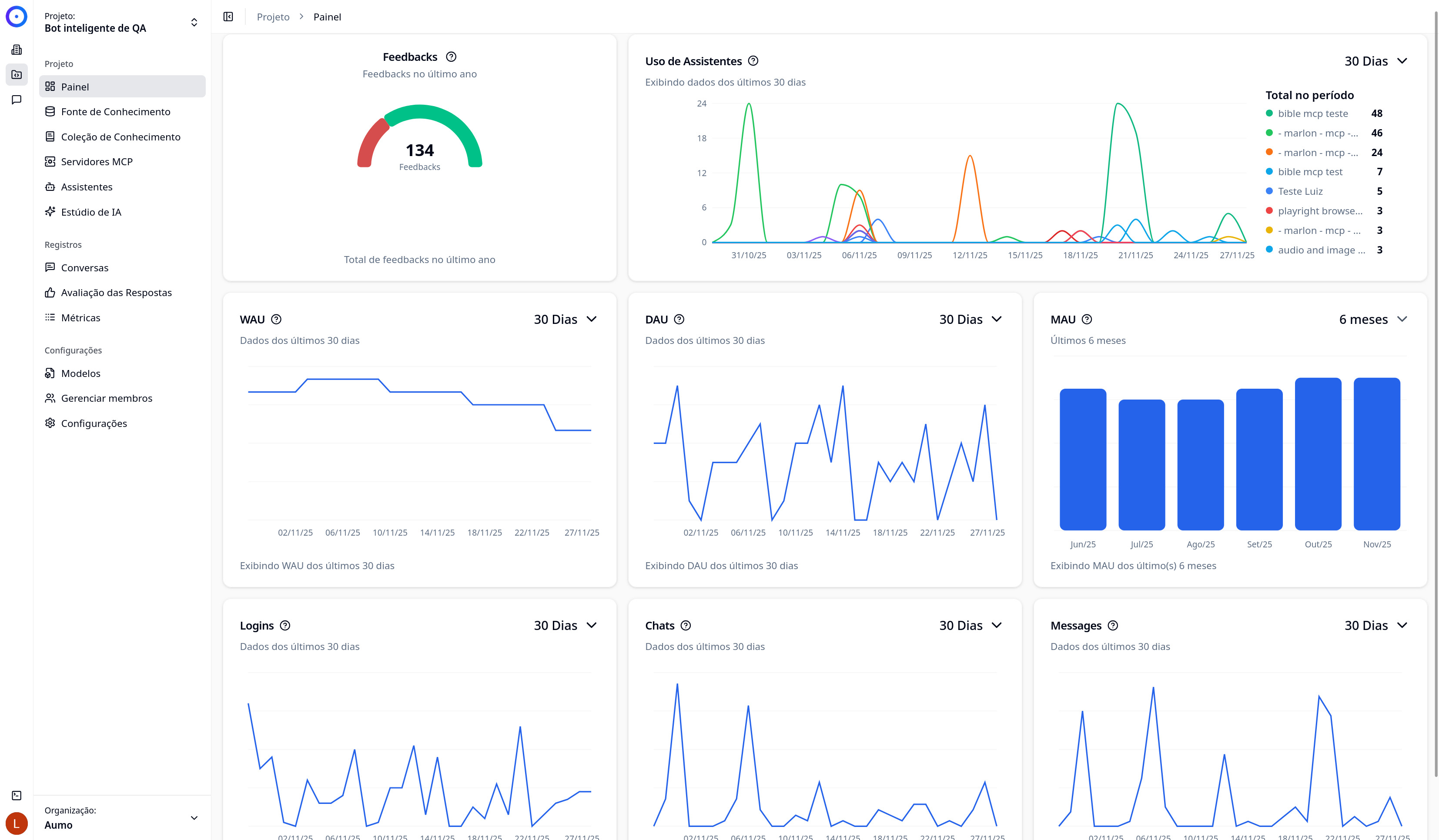
Dashboard (Analytics)
The Dashboard is the analytics and metrics page for your project (workspace). It provides an overview of the performance and usage of the platform, allowing you to monitor activities, interactions, and important metrics of your workspace.
Overview
The Dashboard displays real-time graphs and metrics that help you understand:
- Platform usage: How many users are active and how they interact with the platform
- Assistant activity: How the assistants are being utilized
- Time metrics: Trends over time with different analysis periods
- Temporal analysis: Visualization of data in time series to identify patterns
Accessing the Dashboard
To access the Dashboard:
- Navigate to the Projects section in the side menu
- Select the desired project
- Click on Dashboard in the project's side menu
Dashboard Components
The Dashboard consists of various cards and graphs that display different metrics. Each graph is interactive and allows you to explore the data over different time periods.
Period Filters
Each graph has period filter buttons that allow you to view data in different time intervals:
- 30 Days: View data from the last 30 days
- 6 Months: View data from the last 6 months
The period filters allow you to adjust the granularity of the displayed data. Smaller periods (30 days) show more details, while larger periods (6 months) show long-term trends.
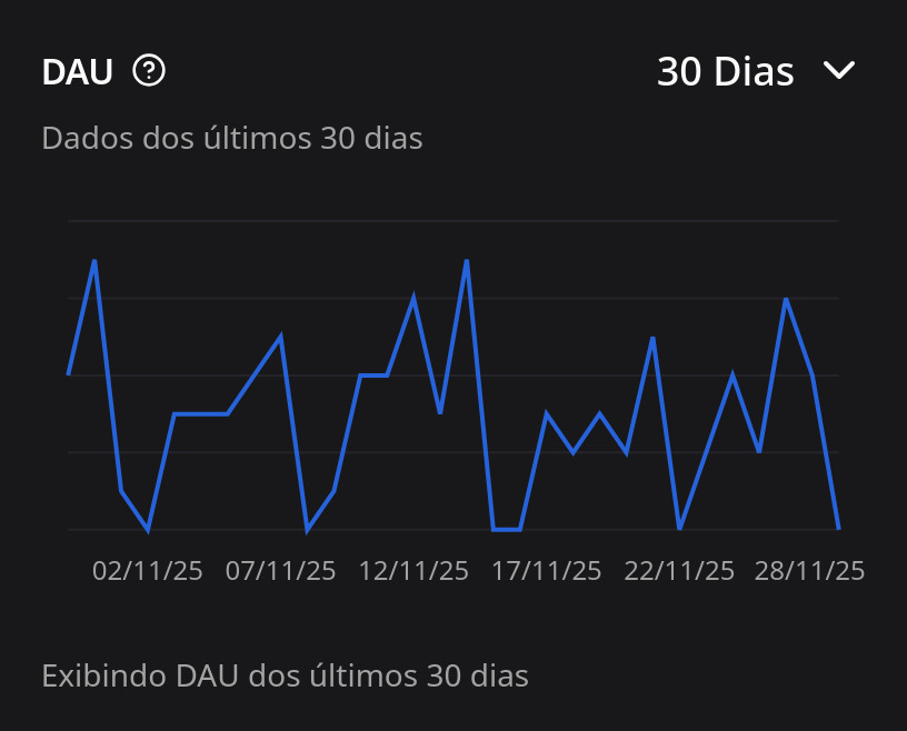
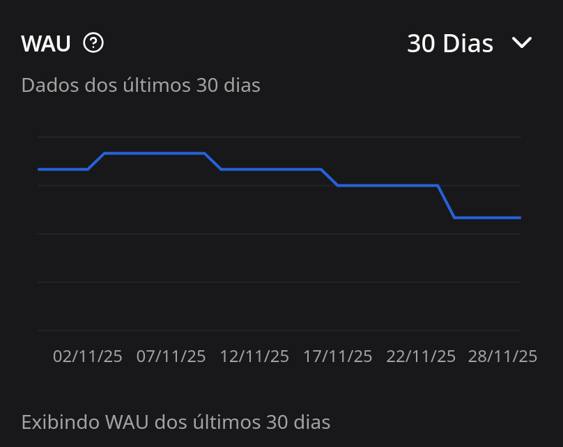
Active User Metrics (DAU, WAU, MAU)
The Dashboard displays active user metrics that are calculated based on login events on the platform. These metrics help to understand user engagement:
DAU (Daily Active Users)
- What it is: Number of unique users who accessed the platform on a specific day
- How it’s calculated: Counts unique users who logged in within a 24-hour period
- Purpose: Helps understand daily engagement and identify activity peaks
- Interpretation: High values indicate good daily adoption; increasing values indicate growth in usage
WAU (Weekly Active Users)
- What it is: Number of unique users who accessed the platform in a week (7-day period)
- How it’s calculated: Counts unique users who logged in during a calendar week (Monday to Sunday)
- Purpose: Provides a medium-term view of engagement, smoothing daily variations
- Interpretation: Useful for identifying weekly trends and comparing different weeks
MAU (Monthly Active Users)
- What it is: Number of unique users who accessed the platform in a month
- How it’s calculated: Counts unique users who logged in during a calendar month (from the 1st to the last day of the month)
- Purpose: Provides a long-term view of engagement and user base growth
- Interpretation: Increasing values indicate sustained growth; useful for retention metrics
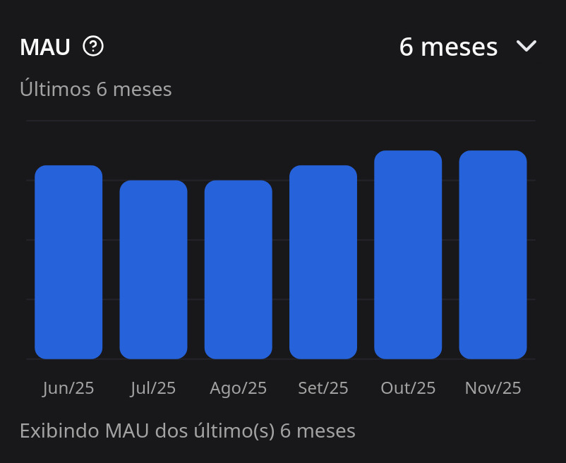
Note: WAU and MAU metrics use calendar limits (week/month), not sliding windows of 7/30 days.
Time Series Metrics
The Dashboard displays time series graphs that show the evolution of different metrics over time:
- Format: Line graphs where each point represents a day
- Data: Aggregated daily, showing the count of events per day
- Visualization: Allows identification of patterns, activity peaks, and trends
- Interactivity: You can hover over the graph points to see specific values for each day
Types of metrics displayed:
- Authentication events (logins)
- Interactions with assistants
- Created messages
- Other system events
Assistant Usage
The Dashboard includes specific metrics on the usage of assistants:
- Usage distribution: Shows which assistants are most used
- Temporal trends: Graphs showing how the usage of each assistant evolves over time
- Daily aggregation: Data aggregated by day, allowing identification of usage patterns
- Grouping: Unidentified assistants are grouped as "unknown"
How to interpret:
- Assistants with increasing usage indicate good adoption
- Balanced distribution among assistants suggests diversity of use cases
- Usage peaks may indicate specific events or campaigns
Interpreting the Data
Understanding Trends
- Upward trend: An ascending line indicates an increase in the metric over time
- Downward trend: A descending line indicates a decrease in the metric
- Stability: A flat line indicates that the metric is constant
- Peaks and troughs: Sharp variations may indicate specific events or seasonal patterns
Comparing Periods
By toggling between "30 Days" and "6 Months," you can:
- 30 Days: See recent details and identify short-term changes
- 6 Months: See long-term trends and identify seasonal patterns
Relationship Between Metrics
- DAU vs WAU vs MAU: The relationship between these metrics indicates usage frequency
- If DAU ≈ WAU ≈ MAU: Users access almost daily
- If MAU >> DAU: Users access sporadically
- Assistant usage vs active users: Helps to understand if the increase in users results in more assistant use
Use Cases
Monitoring Growth
Use the Dashboard to monitor platform growth:
- Track the increase of DAU, WAU, and MAU over time
- Identify periods of accelerated growth
- Compare different periods to measure the impact of campaigns or changes
Engagement Analysis
Understand how users are engaged:
- High DAU values indicate frequent usage
- The relationship between DAU/WAU/MAU shows return patterns
- Assistant usage indicates feature adoption
Problem Identification
Use the metrics to identify issues:
- Sharp declines may indicate technical problems
- Reduced usage of assistants may indicate quality issues
- Unexpected variations warrant investigation
Next Steps
- Explore the different graphs and metrics available
- Experiment with different analysis periods to better understand the data
- Use the metrics to make informed decisions regarding platform usage
- Monitor regularly to identify trends and patterns